Aidan Slingsbya.slingsby@city.ac.uk
Tool for exploring the data from Emiel's Data Challenge from the Dagstuhl workshop
Representation, Analysis and Visualization of Moving Objects held in December 2012. Note that this prototype is unfinished and poorly documented due to limited time.
The data challenge related to modelling bird behaviour using accelerator-derived information and some labelled behaviours.
This is my entry to the "visualisation" aspect of the challenge, which was to visually depict the modelled behaviours, where and when they occurred and how well they matched to the modelled behaviours.
For more details, read the data challenge document.
Download here. Read readme.txt for instructions on how to run.
These have been hastily described below for the purpose of helping interpret the views in the software. Contact me for more details.
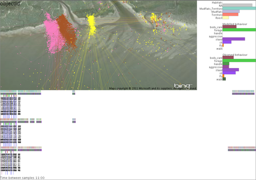
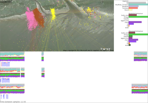
Map coloured by individuals (there are 3), with Bing satellite imagery in the background. Barcharts of time spent in each habitat, modelled behaviour and observed behaviour. Timeline split horizontally for each individual, for the whole of the time period with measurements taken in July (left) and measurements taken in February (right). It's difficult to see, but it can be zoomed (see next) and binned into temporal bins (see later). Moving the mouse over points in the map and timeline highlights those in the other.
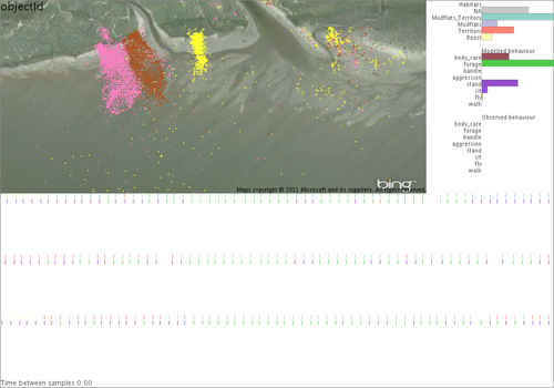
Zoomed in on the timeline. The time threshold (see bottom) is zero, GPS point treated as instantaneous values (compare to below).
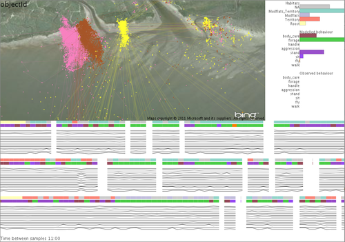
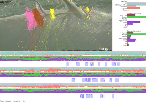
Time threshold is set to 11 mins, so GPS readings are given a "duration" to the previous GPS point if within this threshold. This is reflected as lines joining the points in the map. The black graphs are the "features" (speed and accelerometer information) used for classifying behaviour.
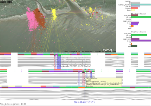
On the timeline, each individual has three coloured rows. From top to bottom this is habitat, modelled behaviour and observed behaviour (see bar graphs for colour legend). Observed behaviours are few and far between. Matches between observed and modelled are shown as blue or red vertical stripes. Where dark blue is perfect match, light blue is partial match (same parent super-category) and red is no match. The tooltip shows the details for a specific GPS point.
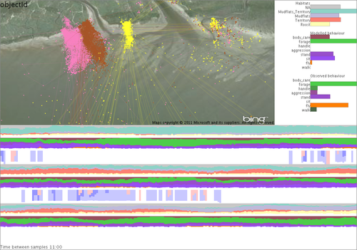
Binning the timeline into bins that depend on the zoom line and summarising habitat (top) and modelled behaviour (middle) as stacked barcharts gives us a more effective overview. The two shades of blue and red in the lower portions tells use how well the model matches with the observations.
Showing time on a daily cycle from midnight to midnight shows that observations were only made during the day. It shows that the model matches observations reasonably well, but it's worst for the middle individual.
Zooming in temporally re-bins the data on-the-fly.
This was hastily put together for the data challenge, but is not finished. More work need to be done on the map (probably using density surfaces). I'd also like to support labelling, comparing alternative models and looking and model classification uncertainty (where the classification model used allows).
Aidan Slingsby
a.slingsby@city.ac.uk